

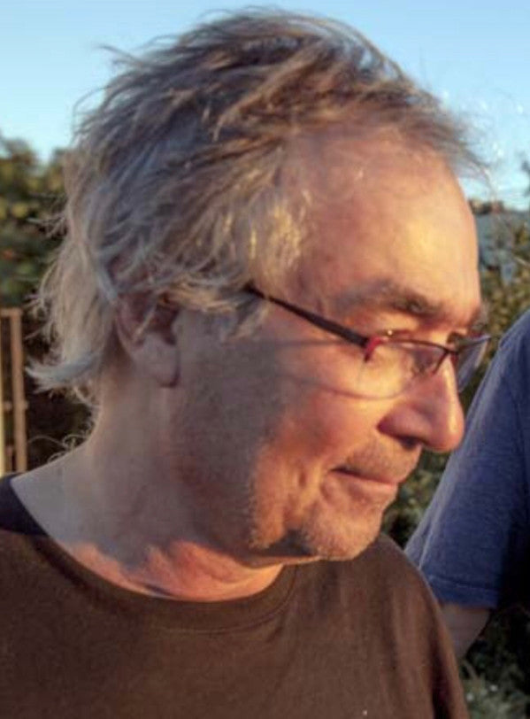
Steve Byram is a designer with an instantly recognizable approach, one which is iconic to a certain coterie of listeners through his work designing an inestimable number of records for New York's so-called “Downtown Scene” of the late 80s and 90s. Beginning in 1990, Byram lent his irreverent hand to New World Records and our CounterCurrents imprint.
New World's Sam Weinberg (@swabregimen) catches up with Byram for his take – now thirty years after the fact – on many of his designs for NWR and related matters.
Well I hope that talking about these CounterCurrents releases will be the occasion for something of a trip down memory lane for you…
Indeed it is! I haven’t looked at most of these for a long time. A good fifty percent of it was done before I was even using a computer! [Laughs.] I didn’t start using the computer until '94 maybe, '95?
All the Screwgun stuff was done on the computer though right? I think I read an interview with you where it was revealed that somehow …
Right, by the time I was doing Screwgun stuff I did have an idea of what I was doing with the computer. You never really know what you’re doing, but all of the Screwgun stuff and everything since has been done on the computer. But there was a period of time in the early '90s, when I was doing CounterCurrents, where I was scared of them! They didn’t make any sense to me, but then I realized that if I didn’t figure out how to use them, that I might as well not be a designer anymore. An ex-student very generously offered me the use of this little tiny Mac that she had – the hard drive was under one hundred megabytes or something. I mean really tiny! So I fiddled around with that and called friends when I got myself into trouble and in doing so I kind of figured out how to use it. I then borrowed some money from a client I had in Germany and bought myself a PowerMac and I’ve had quite a few since then, so there you go.
Well maybe we can track some of that history and see its emergence and evolution. You have a pretty definable signature in your approach to design, and even if things don’t end up looking especially similar -- and this is an amazing quality of yours as an artist, I would say -- I can often know that things have a Byram signature.
Ya, I look like me! [Laughs.]
Yep -- you look like you even if those things don’t look the same. It’s an amazing trait. There are tactics that you use to achieve that -- traditional things that you obscure in the process, and a certain sense of humor, doing droll things like crediting yourself with “character assassination” as opposed to design. I’m wondering if there’s a set of guiding principles that you use in all projects in which you’re given any sort of creative latitude? If you could even generalize about such a thing…
Geez, well I don’t know. As far as things looking like I’ve done them, I have a certain way of doing things and I’ve found that those approaches can kind of be endlessly fiddled with, so that you don’t come up with… Back in my very early days of being a designer I got into a debate with one of the people that I worked for -- the design director at CBS Records -- because he was of the view that a good graphic designer was a chameleon, and that whatever the project was, that that’s where that designer would go. And I said, ‘Well, maybe, but I’m interested in having something of a signature.’ To which he said, ‘Those might all end up coming out the same,’ and I replied ‘Well that’s the trick, isn’t it?!’ So I’m interested in enough different kinds of things that I think I can…and it’s not like I’ve never repeated myself, well I’ve never exactly repeated myself. But I’ll take something and follow the thread of it and that, to me, is interesting.
I kind of thought –- and I did it once –- that all the CD packages I’ve done which all accordion fold out, I wondered what would happen if I ran them all together (laughs) and I did it! I had this opportunity to put up a bunch of the CD work that I had done, and I had this idea, so I figured that all CD packages are, what, four and a half, five inches tall, so I just kinda like made a big stripe around the room and connected one thing to the next. And it was really interesting, it was almost like an animation!
In chronological order?
No, I fit them together how they worked graphically. But the amazing thing was -– and they covered quite a few years of work –- but I could stick them together and they came out, to me at least, to form a coherent piece. But this is my body of work, this is what I do! I’m going to do things in a certain way but I’m never going to repeat myself because I’m always looking for another idea, or angle, or thread to pull on whatever I’m working on. I believe if an artist pays attention to that…well you can look at anyone, I mean if you look at Picasso –- and I am not at all trying to compare myself to Picasso, I would never do that –- however if you look at him, you can spot a Picasso when you see one, but they don’t really look the same. I mean, it’s like he’s taken something and followed it to its logical conclusion, and that’s how I see actually most artists working.
So since you mentioned it briefly, your work with CounterCurrents comes on the heels of your time as the Art Director for CBS, which was 1983–1990. That has always seemed to me like something of a coup that you were in there and for that same reason that you were talking about –- potentially some tension between you and the higher ups there. I’m curious about that time, and maybe some of your favorite projects from it. I think it’s safe to say that License To Ill is probably the most famous, but curious to hear about others and maybe Sanctified Dreams & Fulton Street Maul, your first two records with –- who went on to become –- your long-time collaborator and friend Tim Berne.
Well ya the stuff that I did for Tim was really great. I got hired at CBS because I was kind of a post-punk weirdo, and they didn’t really have someone who did that stuff there. They never let me work on mainstream big acts or anything like that, because they were afraid of what I’d try! [Laughs.] I would’ve had great fun doing something like that! So I grew up in the 60s in California, in Oakland, and in that particular time all this psychedelic stuff was happening and there were all these posters. It was those things that opened my eyes and really made me want to become an artist, it wasn’t because I used to go to museums. I didn’t know anything about fine art at all, but I liked rock and roll. So that’s what I wanted to do and that’s why I went to art school, that’s why I came to New York, it’s why I did all that stuff.
I was interested in all that and I figured what the heck, it’s rock and roll you can do all kinds of ridiculous stuff. I never really could do that much at CBS. If you think about it, License to Ill is an interesting package which I got because nobody else wanted it! That was the dawn of Hip-Hop as far as CBS and major labels were concerned. Their attitude was, ‘Give it to Byram because none of us want to work on it!’ I met Rick Rubin and I liked him, I got along well with him, and I liked his approach to things. So we talked about design, and I then went to a guy I went to art school with, in California, to do the illustration for me because I thought he would be perfect to do it, and we kind of made this mess that was almost a parody of…if somebody else had done that package it would’ve been almost like hypnosis –- a beautiful dye transfer of this plane crashing into a mountain, and it would’ve looked like petite surrealism. And I like hypnosis, don’t get me wrong, but I wanted to do what a fucked up Dadaist would do with something like that! And that was basically the thing with License to Ill. Since nobody cared about it, and nobody thought that any of that would succeed, I could do what I wanted. I liked being in that position –- give me the crap that nobody else wants and I’ll make something interesting out of it.
So it finally got to the point where I was feeling hindered at CBS; I’ve got drawers full of crap that they killed. And through Tim, I met Stefan Winter who had a label in Munich called JMT. In fact I did a painting for Fulton Street Maul and Tim was coming in to see it and he came in and I had it all mocked up and everything, and he brought Stefan with him. So when they came in I said, “Well I’m going to show you this, but I’ve been told by my boss that it’s dead, it’s been killed because they don’t like it.” I was really pissed off! And so Stefan is standing there watching all of this and says, “Do you mean to tell me that this isn’t going to be the cover of the record?” And I said that it wasn’t, and so he asked if he could use it for something, and I said sure. [Laughs.] So it ended up being a Herb Robertson record.
One of the early JMTs?
Exactly, one of the early JMTs. So after that, Stefan and I started working together and Stefan was into weird stuff. Tim was eventually dropped by CBS, after Sanctified Dreams, and Stefan started putting out his records. Tim then brought the whole crew of people that he was working with and they had their own bands, and were in each other’s bands, and there was this whole New York scene at the time. Tim started funneling that to Stefan, and Stefan started putting out the records. I was there and did all the covers and it was something closer to what I wanted to do, and much more than I was allowed to do at CBS, so eventually I just said ‘fuck it’ and went freelance.
Let’s see, around that time Artie Moorhead was at New World Records and was a friend of Tim’s and he called me up and hired me –- not sure what the first record was – but that began my relationship with New World.
So it seems like you were working on the CounterCurrents stuff pretty much concurrently with JMT?
Ya, I think the JMT stuff started before, but I was doing those things simultaneously. And for that matter, into the 90s, I was working on CounterCurrents stuff right before Screwgun started. But I was certainly doing the stuff for Stefan at the same time as Countercurrents, for sure.
I’m curious if there was any aesthetic guidance for CounterCurrents? Were there any restrictions or if you had total creative latitude in your approach to these designs? Because you were effectively on retainer for years!
Ya I was the guy they gave it all to! So I don’t know, I don’t remember – if I did something a bit too weird they would tell me no, but I can’t remember. Of all the stuff I did I have no memory of anything being constricted! Ultimately the label moved onto other art directors and I went bye-bye.
And that’s really funny because when I stopped, New World had been one of my bread and butter clients and I depended on them – and so was JMT. So around the same time that I lost my tenure at New World, JMT was bought by Polydor. And it ended up getting shut down in a hideous way. I remember they were having the 10th anniversary celebration of JMT Records at the old Knitting Factory and we got these big oversized print making things and we made all of this art and essentially wallpapered the inside of the old Knitting Factory. It was going to be this big celebration for the anniversary. And on the last night of it he announced that JMT was effectively shutting down. He hadn’t told anybody. That started a rift between him and Tim that never healed.
He did this thing Winter & Winter – and in fact Winter & Winter still exists and I did stuff for them in the beginning and then he started working with a German designer and I started working with Screwgun which would’ve been sort of a conflict. So I went with Tim and I did that. After New World dropped me and JMT went down I was kinda like, ‘Ok what am I going to do to make money?’ So I called up my old boss who was now at Sony (which had been CBS), and he became the design director there. So I asked if he needed anyone to sit in for him during Summer vacations and he said fine and I ended up staying there for six years. [Laughs.] So I did that and during that time I was still doing Screwgun stuff and all sorts of other stuff along the way.
Well you did come back to do one more New World disc, after CounterCurrents –- Tim’s The Sevens.

|
Yaaa! That was a really cool package, done entirely on the computer. The cover image was by a photographer I had worked with for years named Robert Lewis – he did a lot of JMT stuff and did several New World things like the cover for Joey Baron’s Raised Pleasure Dot, he did the package for Bob Nell’s Why I Like Coffee. At any rate, he had visited Egypt, and the cover for The Sevens was a detail of a picture of a door that he had taken in Cairo. |
It almost looks like a blackboard or something.
Ya he was walking around Cairo and had come across this door where somebody had scratched off all of that stuff and he took a picture of it. I had been looking for a cover image for Tim’s record and he said that it was cool, so I took it.
Well it’s a beautiful package. But I’m glad you mentioned Raised Pleasure Dot because that one was one of the more distinctive of the Countercurrents covers – and anxiety-inducing! Because it looks like this balloon about to be popped on the edge of this needle…

|
You know what that was!? Joey, at the time, was kind of into doing magic tricks, ok? And he’d fuck around doing slight-of-hand stuff, and it was quite amusing, especially since he was halfway good at it. I was over at Robert’s place, which is where we shot that photograph, and Joey brought some of his magic stuff over. And that was this ball that looked solid but which you could crumble up into nothing and keep in your hands to make it seem like it had disappeared. And I brought over some metal stuff – since we were doing a still life we didn't really know what we were going to do – and I put that stuff together and took that little ball and it just balanced perfectly on there. And since the name of the record was Raised Pleasure Dot (emphasis) I thought it was funny. But it was kind of a foam material, that ball.
And it’s a cool illusion because it looks like a balloon or something; much more precarious than it likely was.
Absolutely. We put it there and it kinda stayed.
Maybe this is a naive question but was the choice to use photographic images on these few titles – as opposed to your own images and drawings – a choice you made or as it the artist’s volition?
 |
It depended. Sometimes I’d be given things from the musician and I’d design around it. There was a Robert Ashley package for Superior Seven/Tract which is really one of my favorite records, actually – I’m a big fan of Robert Ashley. And there was a collage artist that Ashley wanted to use, so I was given a piece of art and I used it. There was a Butch Morris record where he brought in the art. It didn’t matter. Most of the time there was no art so I had to either make something up, or get somebody else to do it. |
I’m wondering if you have any favorites from this period of working with New World. Or, if now looking back thirty years later, certain things strike you with new force.
I do, yes! Well Raised Pleasure Dot I really like for all the reasons we had just been talking about. There was a Mario Pavone record called Song For Septet; the art for that was actually done by Tim’s sister Betsy Berne. And she’d do these kinds of oil paintings on heavy paper and I really loved them. Tim had a couple hanging in his house and I was friends with her at the time so I was over at her studio just hanging out and since I liked them so much I was able to talk her into letting me use two of them for that cover.
 |
 |
There was the Bern Nix Trio record Alarms and Excursions and the artwork for that was done by a colleague named Jonathan Rosen who I go way back with, he’s from Los Angeles originally. Jonathan is a really great animator and later on, in the early 2000s, we went to England with Tim, and a bunch of laptops and some VJ software with a bunch of clips we had made, and did an update on the light show while they were playing. So I like that package.

|
|
There was another Mario Pavone record called Toulon Days, and the artist on that was a colleague named Warren Lin who I still work with – in fact we just worked on a couple packages for Michael Formanek. Warren also did the collage for the Dave Taylor New World record Past Tells. That’s my favorite design in the bunch, I think. |
|
|
|
Ya one of mine too – it’s a really beautiful package. Another one is the Marty Ehrlich record called Just Before The Dawn. |
|
|


I did the cover on that and the inside of that was…well at the School For Visual Arts where I taught for a long time I taught a class of Japanese students when SVA was enticing all kinds of wealthy Japanese kids to come over and go to art school in New York. My department head asked me how I’d feel teaching a Japanese class and I said, “Well I don’t speak Japanese, what the fuck do you want me to do?” And he said “No man, you don’t have to speak Japanese –- you can do whatever you want! It’s basically an excuse for them to practice their English.” I thought that was funny. So I ended doing it for five years and really loved it because I would make up all of these really stupid assignments and the kids would dive in! And they would do such amazing work. I would say to them all the time, “Well shit! I wish my American students were as enthusiastic as you guys!” At any rate, I became friends with a couple students along the way, and Hiroshi, the guy who did the artwork on the inside of the Ehrlich disc, is still in New York –- he stayed! So that was interesting.
There’s a Ned Rothenberg record called Power Lines and that was one of my very early experiments with Photoshop. It was kinda like, Ok I’m doing this in Photoshop but I don’t know what I’m doing or what’s going to happen.
 |
 |
I also really like the design for Robert Dick’s Third Stone From The Sun.
Yes! I was about to mention that one. Now that was not on the computer. That was all cut up and pasted down – I just made that as a piece of art. I’m looking back now and the two background pieces were basically color Xeroxes of texture. I’m a big collector of crap! Now there’s the New York Composer’s Orchestra, a friend of mine named Karen Caldicott and she’s an illustrator from England who came over here. For a period of time she was doing … A lot of artists I know, and people in general, are doing ceramics now, it’s the big thing. Well Karen started fucking around with ceramics a long time ago and was making these really weird things with them. And I really loved them, so I asked her for a picture of one of them to put on a cover and that was one of her things.
It also has this almost ancient quality to it, too.
Exactly, exactly! I kind of got the impression, and this was early on in her experiments with this, but she kind of didn’t know what she was doing! And that’s a great way to do things! I tell my students all the time that the most fun you’ll have on something is before you master it, because you don’t know what you’re doing, you don’t have any rules, and you’re just trying to make it work.
One other thing I want to ask about is typography and typesetting. I sort of associate, rightly or not, the font that was used on the Dick release and changes in capitalization and spacing as part of your visual syntax. But then of course there are other fonts and type settings –- the same used on the Far East Band Caverns and Human Feel’s Welcome to Malpesta.
 |
 |
Well they were normal fonts. The Robert Dick thing was… well I’m not sure what font it started out as, but I was into degrading things in a Xerox machine, and then cutting them up and putting them back together. Just overexposing things, messing them up, watching them fall apart and then using parts of them. But I’ve always had an interest in bouncing type as far capitalization, big or small, and I mean a similar thing is happening with that David Taylor Past Tells. That was just something that I was amused with at the time, because to me there were plenty of people out there that were doing conventional type, beautiful type, and all that kind of stuff. But for me and my approach, I’ve always considered myself kind of a Dadaist in a lot of ways, even though my view of Dada has moved beyond its original intent but I mean the whole spirit of the thing in trying to find beauty in something ugly, and I don’t think that that was their intent, I think they were saying fuck you, you guys are so fucked up and after WWI you don’t deserve anything beautiful. I’m not saying that, but the thing that struck me about Dada is that there are these things that a lot of people call ugly but which have this uncanny beauty to them. That principle has informed my typography, my imagery, and all that kind of stuff.
And it’s evolved to a place where it’s its own thing, with its own grammar – you’ve created a universe out of that language basically.
Well thanks! This was fun. It was really great. Like I said, I’ve got so much stuff at this point that I rarely go back and look at stuff this old! Because I’m busy making new stuff. So this was a treat.
//
This interview was conducted by via Zoom on January 12, 2022 and edited for length and clarity.